

Everyone prefers to have a single score so they can easily understand where they stand. In our niche, Lighthouse is the best example. So we copied that idea, but then based on pagespeed numbers of your real users.
Web performance is far more nuanced than a single number. But sometimes, a single score is what gets the conversation started.
That is one of the reasons why performance scores such as Lighthouse have become so widely used. A score gives developers, marketers and business stakeholders a shared point of reference. The limitation is that a Lighthouse performance score is based on a synthetic test run under controlled conditions. It does not represent the distribution of experiences that real visitors had on your website.
For Sitespeed User Experience (SUX) to become something an entire organization can work with, performance data needs to be understandable outside of engineering teams as well. Business stakeholders often want a simple number first, after which they can dive into the underlying metrics.
That is why we use several real-user performance scores to translate technical performance data into a more accessible 0 to 100 scale. In this article, we explain the thinking behind these scores and, more specifically, how we calculate the CrUX-based score used in our PageSpeed UX Score checker.
Differentiating our performance scores
Depending on what you are trying to analyze, RUMvision works with different datasets and scores. They share the same goal of making performance easier to interpret, but the underlying source of the data is different.
1. The CrUX score
This score is based on Google's Chrome User Experience Report (CrUX). CrUX contains aggregated field data from eligible Chrome users and is publicly available for origins and URLs that have enough data.
We use CrUX data in our Core Web Vitals technical report, competitor comparisons and free UX score tooling. Because the dataset is standardized across websites, it is particularly useful for benchmarking your performance against competitors and tracking changes over time.
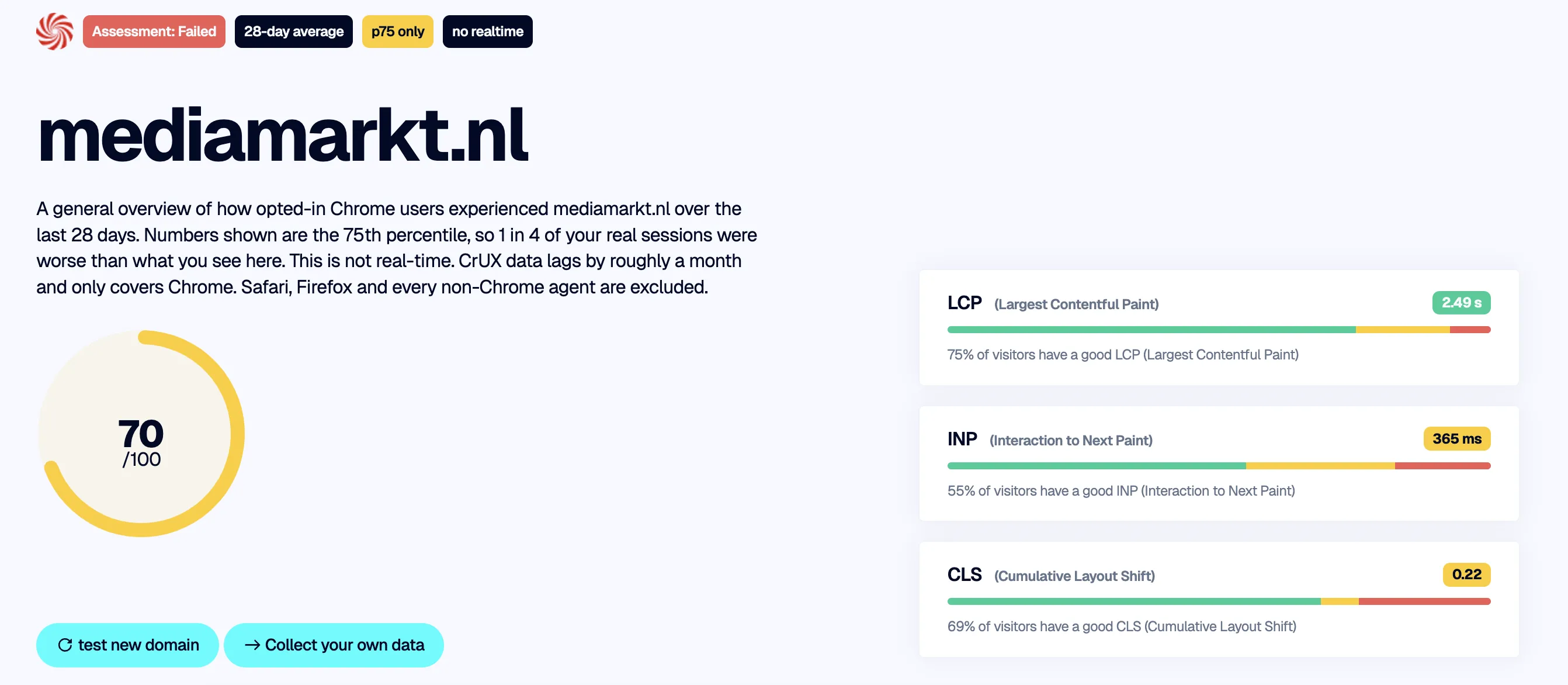
CrUX score from our Technical report free tooling, based on public real-user performance data from CrUX.
2. RUMvision dataset scores
Inside the RUMvision dashboard, scores are calculated from your own Real User Monitoring dataset. This gives you much more granular insight into the visitors, pages and journeys that are actually occurring on your website.
- SUX score: Sitespeed User Experience. A 0 to 100 score that summarizes the overall performance experience measured in your RUM dataset.
- FUX score (First UX): Focuses on first or unique page-view experiences. This is useful when you want to understand the experience of visitors entering your website, for example through campaigns or landing pages.
- SPA score: When Single Page Application tracking is used, soft navigation experiences can be scored separately from traditional initial page loads.
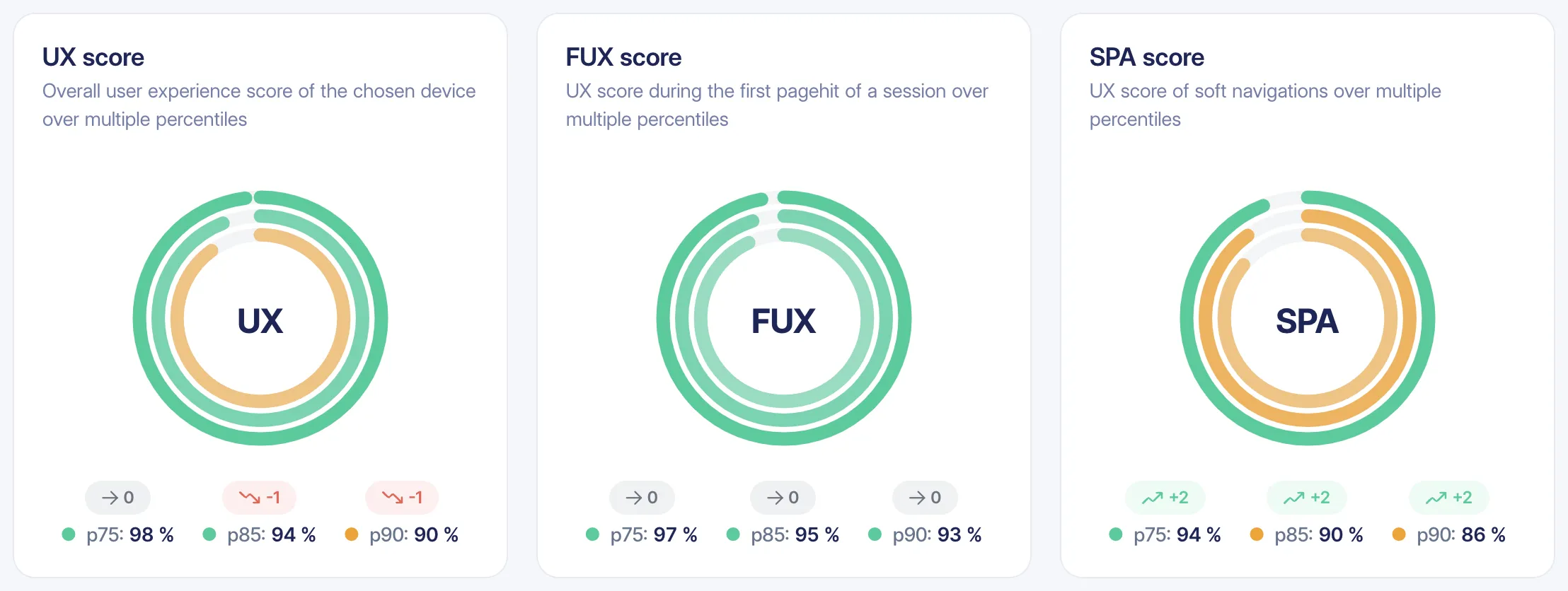
Scores from a SPA site in RUMvision, based on real-user data and showing different percentiles and recent trends.
How our CrUX score is calculated
The CrUX score is not a Google score and it should not be confused with Google's Core Web Vitals assessment. It is our own way of translating several field metrics into one 0 to 100 number.
The calculation starts with the 75th percentile, or p75, for each available metric. In CrUX, a p75 value means that at least 75% of the measured page loads had a metric value at or below that number.
For historical CrUX data, each weekly data point represents an aggregated 28-day collection period. This means consecutive historical data points overlap. The history is therefore best interpreted as a moving view of real-user performance rather than as completely separate weeks of traffic.
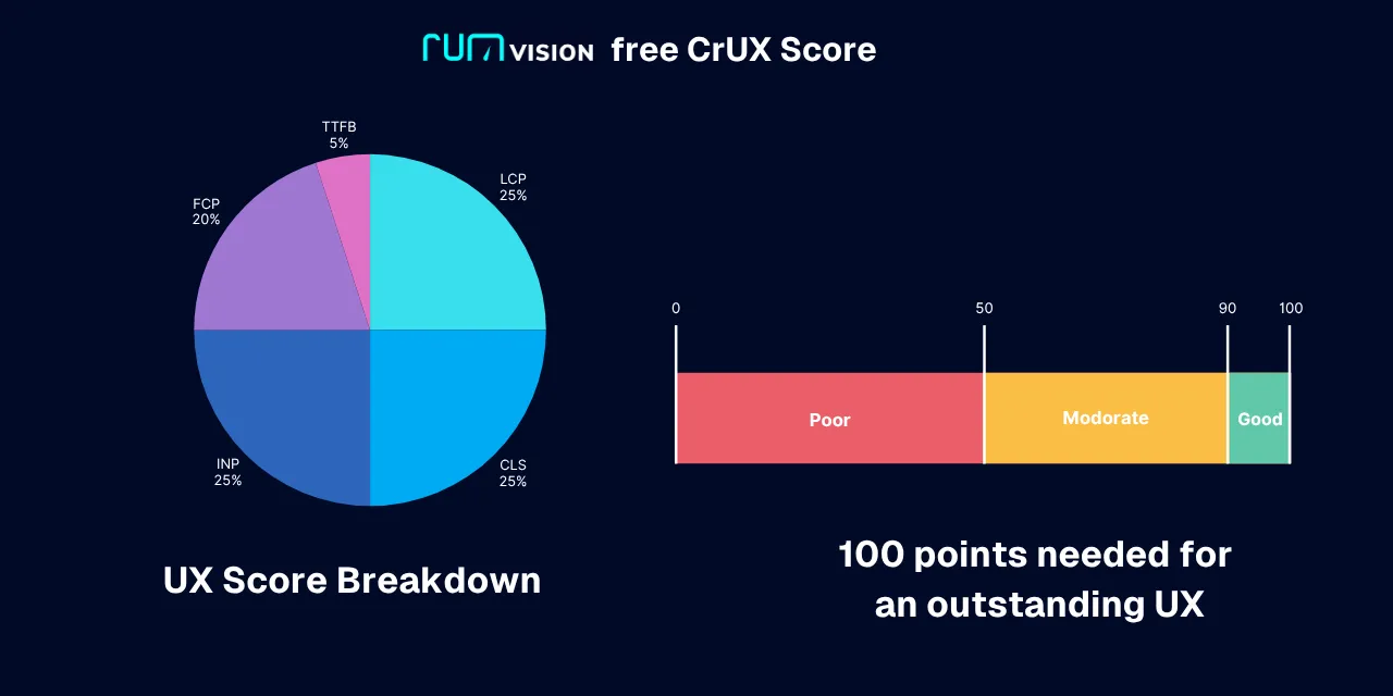
We currently include the following metrics and weights in the CrUX score:
| Metric | Good threshold | Our minimum | Unit | Weight |
| Cumulative Layout Shift (CLS) | 0.1 | 0 | score | 25% |
| Interaction to Next Paint (INP) | 200 | 100 | ms | 25% |
| Largest Contentful Paint (LCP) | 2500 | 1000 | ms | 25% |
| First Contentful Paint (FCP) | 1800 | 500 | ms | 20% |
| Time to First Byte (TTFB) | 800 | 200 | ms | 5% |
CLS, INP and LCP are the three Core Web Vitals. Together they account for 75% of our CrUX score. FCP contributes another 20%, while TTFB contributes the remaining 5%.
From a metric value to a metric score
Each available metric first receives its own score. We use the boundaries supplied by the CrUX histogram to determine whether the metric falls into the good, needs improvement or poor range.
Those three ranges are associated with the following score bands:
| Performance range | Score band |
| Good | 90 to 100 |
| Needs improvement | 50 to 90 |
| Poor | 0 to 50 |
Within a range, the score is calculated based on how far the measured p75 value is from the configured minimum and the relevant CrUX boundary. This allows us to distinguish between a website that is just inside a performance category and one that performs substantially better.
For example, an LCP of 1,000 ms has reached the minimum we configured for LCP and can receive the maximum metric score. A slower LCP progressively receives fewer points as it moves through the CrUX performance ranges.
This scoring model intentionally rewards improvements beyond simply reaching Google's good threshold. Passing Core Web Vitals is important, but a visitor experiencing a 1-second LCP is still having a faster loading experience than a visitor experiencing an LCP close to 2.5 seconds.
Calculating the overall score
Once the individual metric scores are available, each score is multiplied by its configured weight.
The overall score is then calculated as a weighted average:
Overall UX score = sum of (metric score × metric weight) / sum of the weights that are actually available
If all five current metrics are available, their weights add up to 100:
| Metric | Example score | Weight | Weighted contribution |
| CLS | 95 | 25 | 2375 |
| INP | 90 | 25 | 2250 |
| LCP | 75 | 25 | 1875 |
| FCP | 80 | 20 | 1600 |
| TTFB | 70 | 5 | 350 |
| Total | 100 | 8450 |
In this example, the final score is 8450 / 100 = 84.5.
The final overall score is classified as follows:
- 90 to 100: good
- 50 to below 90: needs improvement
- Below 50: poor
What happens when CrUX data is missing?
CrUX does not contain every metric for every origin, URL, device type or collection period. More specific queries generally contain fewer eligible page loads, which means missing data is a normal part of working with CrUX.
Our score calculation therefore does not automatically treat a missing metric as a score of zero.
Instead, several rules apply:
- If a metric is not present in the CrUX response, it is not included in the score.
- If a metric has no percentile timeseries, it is skipped.
- If the current p75 is not available, the calculation attempts to use the most recent p75 value available in the historical timeseries.
- If the resulting metric value is explicitly unavailable, its weight is not included in the overall calculation.
- The overall score is only calculated when at least three metrics are available to the scoring function. Otherwise, the score is returned as 0.
This means the weighting automatically adapts to the data that is available.
For example, imagine that only CLS, INP and LCP are available:
| Metric | Score | Available weight |
| CLS | 90 | 25 |
| INP | 80 | 25 |
| LCP | 70 | 25 |
| FCP | Not available | Excluded |
| TTFB | Not available | Excluded |
The calculation becomes:
((90 × 25) + (80 × 25) + (70 × 25)) / 75 = 80
FCP and TTFB are not assigned zero points. Their weights are removed from the denominator as well.
This distinction matters when comparing scores. A score based on all five metrics contains more information than a score based on only three. The single number should therefore always be used together with the underlying metric data.
A UX score is not the same as passing Core Web Vitals
Our overall score and Google's Core Web Vitals assessment answer different questions.
Google's Core Web Vitals assessment focuses on the p75 values of LCP, INP and CLS. For an overall Core Web Vitals pass, each of those metrics needs to meet its respective good threshold.
Our UX score combines those Core Web Vitals with FCP and TTFB and converts them into a weighted 0 to 100 score. This is useful for communication, benchmarking and prioritization, but it should never replace looking at the individual metrics.
A website can therefore have a relatively high overall UX score while still having a specific metric that needs attention. The reverse is also possible: a site can technically pass all three Core Web Vitals while still having room to improve the overall loading experience.
Why we provide scores per page template
An overall site score is useful as a quick health check, but relying only on aggregated data can leave you blindsided. Pagespeed is more nuanced than a single number.
Experiences can vary significantly depending on the type of page a visitor uses. The performance characteristics of a text-heavy blog post can be very different from a dynamic checkout flow or a product detail page containing large images, personalization and third-party scripts.
This is why RUMvision also provides scores at page-template level. By using regular expressions to group pages, templates can be compared by traffic and performance. This makes it easier to identify which layouts are dragging down the overall experience and where optimizations are likely to have the greatest impact.
Aggregated data can also hide issues related to campaigns, query strings, cache behavior and traffic spikes. Breaking performance down into meaningful segments helps reveal those discrepancies and can, for example, expose caching rules that need attention.
The importance of percentiles and distributions
Google evaluates Core Web Vitals using the 75th percentile. A p75 value is the point at which at least 75% of measured page loads are at or below that metric value.
That still leaves an important part of the distribution on the slower side of p75. Looking at additional percentiles can help reveal whether a healthy p75 is hiding a much weaker experience further down the distribution.
Within RUMvision, we can therefore show scores and metric values at additional percentiles such as P85 and P90. P90 represents the value at or below which 90% of measured experiences fall. It does not tell you why the slower 10% are slower, but it can expose issues that are less visible at p75.
Those slower experiences may be associated with factors such as device capability, network conditions, geography, cache state, page type, third-party code or application-specific edge cases. Percentiles help identify that a slower cohort exists. Further segmentation is needed to understand the cause.
Distribution data provides another useful perspective. Instead of looking only at a single percentile, you can inspect what percentage of page loads falls into Google's good, needs improvement and poor ranges.
CrUX makes this distribution data publicly available for eligible origins and URLs through Google's APIs.
Did you know? Google's CrUX APIs let you retrieve real-user performance data for origins and URLs that meet CrUX's eligibility and data-volume requirements.
You need a Google API key to query the API directly. Or you can use one of our free tools without having to build the integration yourself.

A screenshot of an LCP value that passes at the 75th percentile. Looking at the distribution tells us more: 76.5% of measured page loads have a good LCP, which means the result is only slightly above the 75% level associated with the p75 threshold.
That also means more than 23% of measured page loads fall outside the good LCP range. Depending on traffic volume and business impact, there may still be a strong case for further optimization.
Our additional minimum values help reward improvements beyond merely reaching the good threshold. An LCP moving closer to 1 second receives a better metric score than one sitting close to the upper edge of the good range.

The mobile LCP of rumvision.com at the time of writing. An LCP of 0.68 seconds is clearly fast at p75, but the underlying distribution can still contain page loads with moderate or poor experiences.
At some point, the cost of further optimization may outweigh the potential business benefit. Distribution and segmentation data help you decide where additional engineering effort is most valuable.
Fostering cross-department accountability
A single score gets you through the door. The underlying data tells you what to do next.
A clear performance score gives different teams a shared language. If marketing launches a new campaign, CRO introduces a heavier experiment or development ships a frontend change, the resulting impact can be made visible without requiring every stakeholder to understand the details of LCP, INP, CLS, FCP and TTFB first.
That helps prevent performance from becoming a developer-only concern. It becomes something product, marketing, CRO and engineering can discuss using the same starting point.
At the same time, we will continue to emphasize that no single score tells the complete story. Use the score to identify direction and communicate impact, then use the individual metrics, percentiles, distributions and segments to understand where the actual opportunities are.


